A Conversation with Australian Calligrapher Gemma Black
By: Joy Deneen January 17th, 2019
Today, we’re going Down Under! Based in Australia’s island state of Tasmania,
Gemma Black
is an artist, calligraphic designer and familiar face on the faculty of
past international calligraphy conferences and symposiums. She is a
Fellow of the Calligraphy & Lettering Arts Society (CLAS) and has
worked as a scribe to the Commonwealth of Australia. In the interview
below, Gemma talks not only about her background and favourite tools,
but also shares details about the stirring apology documents she created
for federal government.
Where did you grow up and what first sparked your interest in letters?
I lived in Sydney, Australia for my first nineteen years
with my parents and eight siblings. We all went to Catholic schools and
the handwriting of the day was a copybook Italic with a broad-edged
dip-in metal nib and ink. For four years we were not allowed to use any
other writing implement apart from a pencil. So, I guess I could say
letters found me! A specific memory would be standing in the school
laundry in an apron while my uniform was being washed for all the ink I
had spilled thereon. The nuns used to say to me, shaking their heads,
“Your poor poor, mother, we can’t send you home looking like that.”
What is the first hand that you learned, and which hands resonate with you most today and why?
The school Italic was perhaps a little more rigid than, but
similar to, Irene Wellington’s italic copybook style. It was the first
hand I learned and it is still one of my favourites and most versatile.
Having studied italic with Gaynor Goffe (UK) and then Ethna Gallacher
(AUS) I find the less flourished Italic a legible and very fine hand for
all my government formal documents. I am well versed in many hands but
apart from Italic, I am truly a versal gal. The formal versal and all
its variation compound forms push my boundaries when creating exciting
new letterforms.
Which teachers have made the deepest impact on you and your work, and why?
I have always believed that you can pick up a little
something from every tutor but some special people have made a deep and
meaningful impact on my lettering career as support, stimulation and
inspiration. If I had to choose just a couple they would be
Gaynor Goffe
as I studied with Gaynor for two years on the Roehampton course where
we became close both calligraphically and friendship wise.
Ethna
Gallacher, as I spent a year studying first hand with her on a course
called “Calligraphy in the Making” here in Australia that I later based
my yearlong course “The Way of the Pen” on. Thomas Ingmire, for all
those exceptionally hard versals and Trajan capitals on his yearlong
Graphos course and finally and more latterly,
Ewan Clayton
for giving me so much more of an understanding of the spirit of the
letter and an even deeper understanding of my own spirit and self within
the letters.
Where do you create, and how have you organized your work
space? What is your best time of day, and do you prefer to create in
silence or with music in the background?
As I type, I have been spending my days moving home and
studio. The new studio, like the old, has good space and light within
our home. I like to work a regular 9 to 5 day, though that changes
according to the type of commissions I have on my schedule and whether I
have some tight deadlines. I love working in the stillness of the early
morning, so I may be up very early before breakfast with a hot black
coffee to start my day. My partner David plays oboe for the symphony
orchestra here in Tasmania, so there is always genteel oboe music
filtering in and out of my space. Our schedules are both blessedly full
and when his is not the music, words are my thing… you’ll see.
What are three of the most essential tools for your calligraphy practice and why?
I would say I am generally a broad nib gal and make use of a
range of edged pens. Whilst I do a pretty mean Copperplate it is not my
fav. Of the broad nibs, I can’t do without my “Horizon pens” – the full
set. One winter I tossed up between new winter boots or a set of
Horizon pens. You got it, the pens won and I never did get the boots. I
am also a Brause kinda chick. I love them and find more often than not
they are my “
go to nibs” most
particularly for my compound versals. Finally, in the writing implements
I have to add my ruling pen used to draw fine and expressive
letterforms, I love it/them! There are many old ruling pens I carry with
me and always find just the right one for every task. I know you said
three but I am going to add one more and that is the pencil –
“everything starts with a pencil”.
Could you share about the process behind the apologies
that you created for the Commonwealth of Australia? How did you approach
the design for each document, in regards to the lettering and imagery?
Was there any aspect that was particularly challenging?
The most challenging aspect of the apologies was the emotional attachment I had with the wording. I have done
four Apologies
now for our Federal Government and on each occasion I have been moved
to tears. I am however, a professional. I see my work with the Apologies
as my duty – a gift for me - to create a feeling of sincere artistic
endeavor without overdoing ornamentation or in other words showing off.
Once read, I am able to put my mind in a professional frame of mind and
hope and trust that people who have been affected by any of these
traumas can read these documents and find sincere heartfelt apologies
and start a process of healing.
The technical process is basically the same for each
document. After liaising with the government officials concerned,
sketches are drawn, graphics considered and then the rest is up to me. I
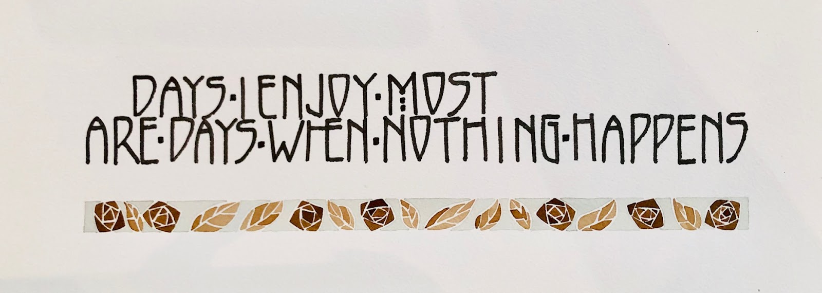
use a minimally flourished classical italic as my text block. It is
legible and very pleasant to read. Perhaps a little wider spaced than I
would normally do as I am keeping future audiences in mind who will be
living in a totally digital world. Mostly I create headings with versals
or lightly decorated gothic capitals, all drawn. Last of all, I
recreate the 1912 version of the official Australian Coat of Arms,
upside down. After all the hard work this is the most enjoyable part of
the document.
Once the documents are completed they are professionally
photographed to allow for high quality reproductions to be made and
given to those people who identify with the Apology.
You will be teaching two classes at Rendez-vous: Retro Deco and Rhythmic Capitals.
What knowledge and skills will students gain after participating in
these classes, and how would you describe your style of teaching?
I coined the title
Retro Deco
to indicate that the course content would be a retrospective look at
Art Deco lettering and graphic style. Participants will gain a greater
insight not only to the well known Macintosh period but also its origins
in the Wiener Werkstätte movement and its influence on the American
paper maker and Deco artist Dard Hunter.
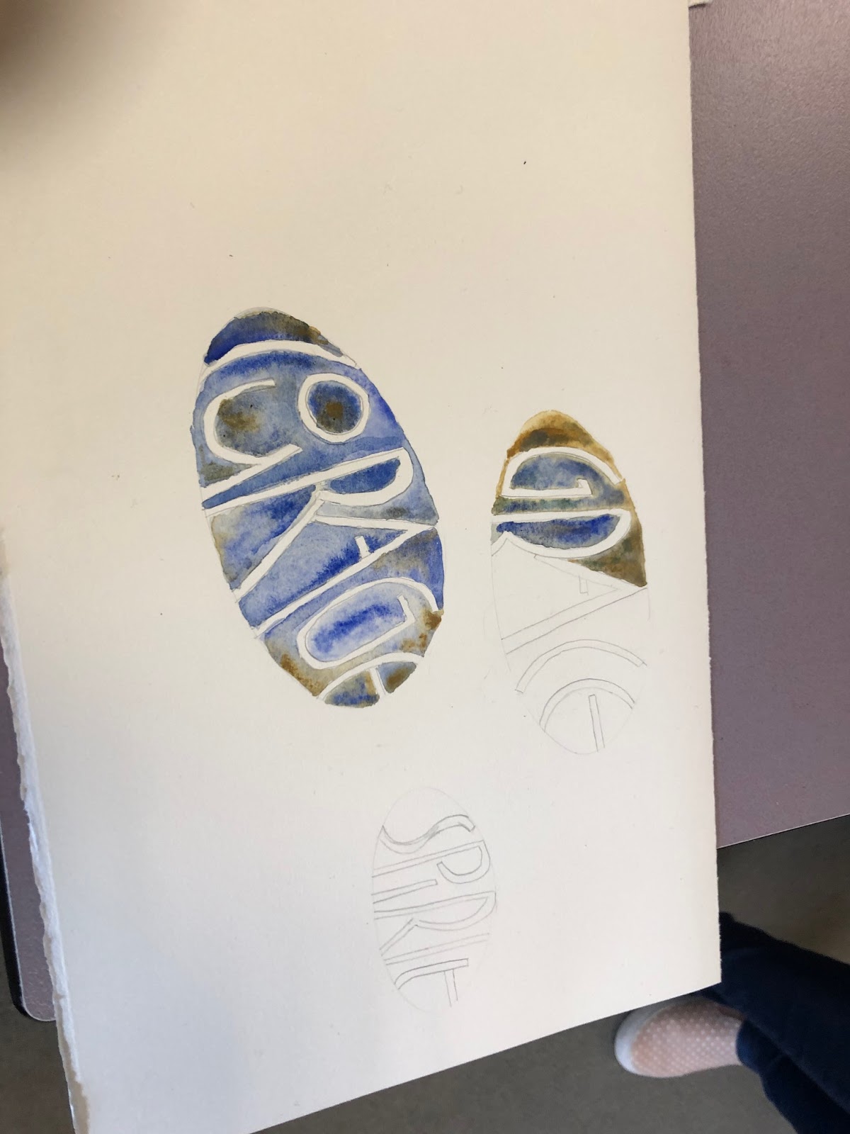
As for
Rhythmic Capitals,
if I were asked what course I jump out of bed in the morning to run and
teach, this would be it. A thoroughly enjoyable look at skeleton forms
and what it means to have sound skeletons and how important that form is
to the end result,
the letter.
The participants will revel in the joy of adding flesh to those bones
and creating amazing interactive lettering designed pieces with lots of
colour. Colour in the backgrounds and colour in the foreground as well
as the drama of black and white. I call them
“alphabeats”!
How would you describe the calligraphy community in
Tasmania and Australia as a whole? What does community mean to you, in
the context of the lettering arts?
Here in Tasmania, there has been an ongoing communal love
for lettering dating back many decades, with two Societies and small
special interest groups flourishing for many years. Interest waxes and
wanes as in any artistic discipline though a hard core of fine
calligraphic artists enjoy shared interest through their groups.
I am keenly interested in the continuance and perpetuity of
the teaching and evolution of calligraphy and lettering. This, I feel,
can only be achieved through healthy community relations and proactive
behaviour of special interests groups. Whether there are ten in the
group, a hundred or a thousand, studying the past, practicing now and
looking to the future and primarily enjoying the journey should be our
goal.
Outside of calligraphy, what are some of your other
interests and hobbies? What might be something about you that people
would be surprised to learn?
Having studied printmaking, bookbinding and watercolour
disciplines as a young adult I use these allied arts to feed into my
primary love of calligraphy. Other than those, I read voraciously.
Books, newspapers and journals become my company. Or, I work whilst
listening to audio books. When I am not working with words I listen to
them. A couple of calligraphers I know do the same and we enjoy swapping
the best audio books we’ve listened to.
Family time is important. Giving of myself as much as I can
to my children and grandchildren before I hit the dust is the most
enjoyable pastime ever …
pure joy!
On a final note and if you have read this far,
good for you: I am sure you will be surprised to learn that I am a synaesthete.
Gemma Black
Australia